Free Editable Bar Chart Examples
Using bar graphs in reports and presentations is always better than using numeric data. It is the most efficient visual tool when it comes to explaining data and comparing various data groups. You can learn about bar chart types from its various examples down here. If you want to use bar graphs to represent complex data in an easily understandable format, then read till the end.
1. What is Bar Chart
A bar chart visualizes data using rectangular bars to plot numeric data from the same group in a categorized manner based on the number of observations. It depicts numeric data in levels where it places the values at one axis and the levels of a data group on the other axis of a graph. Each bar represents a single data category, and it goes up to the length of its numerical value. You can use bar charts to plot data in any document or make your presentations and reports easy to understand. Check out our bar chart examples to learn more about them.
2. The Bar Chart Examples
There are various types of bar charts that you can use to represent data, but if you don't use the right one, then it will complicate your document instead of making it simple. In most cases, we use bar charts to distribute data groups and to compare numeric data values, and we can quickly find out which data group represents the highest data value. Take a look at the famous bar chart examples below and find out where you can create a perfect bar chart.
 |
 |
 |
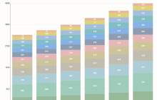
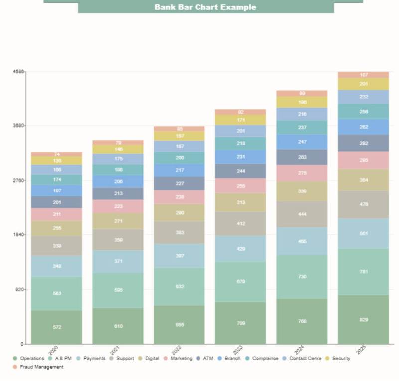
| Stacked Bar Chart | Bar Chart vs. Histogram | Matplotlib Bar Chart |
 |
 |
 |
| Stock Bar Chart | Segmented Bar Chart | Clustered Bar Chart |
 |
 |
 |
| Python Bar Chart | X Bar Chart | Vertical Bar Chart |
Example 1: Stacked Bar Chart
This is an example of a stacked bar chart representing the regional ratio of products. We have the numerical values at the x-axis of the bar graph and the name of products that means data groups at the graph's y-axis. The horizontal bars start from each data group and reach the end of the numerical value. We use different colors in bars to showcase the distribution of product sales for each region. With it, we can quickly classify which products are selling better in which region compared to other products.
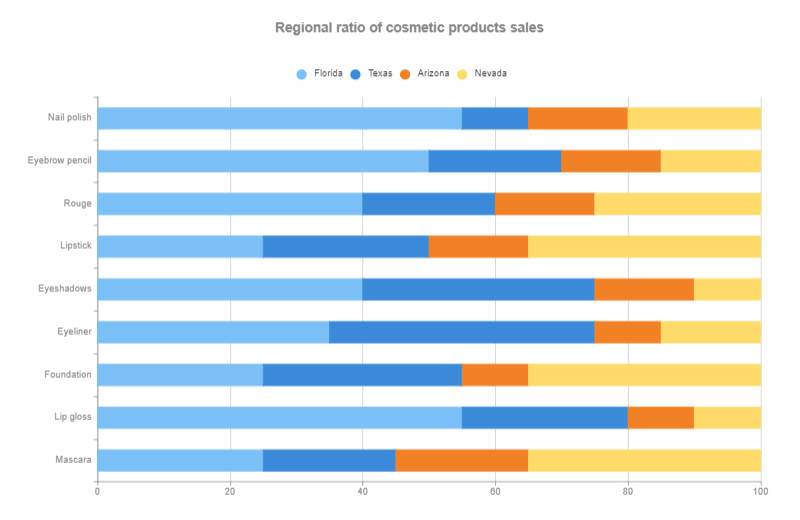
Source:EdrawMax Online
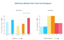
Example 2: Bar Chart vs. Histogram
This example shows the difference between a bar chart vs. histogram. Both of these are similar, which is why it is common to mistake one for the other. Keep in mind that bars are wholly connected in a histogram, but rectangular bars are separate in a bar graph. The bar chart depicts the number of girls in various classes by making a particular group for each category. The histogram shows the marks obtained by students of the same type.
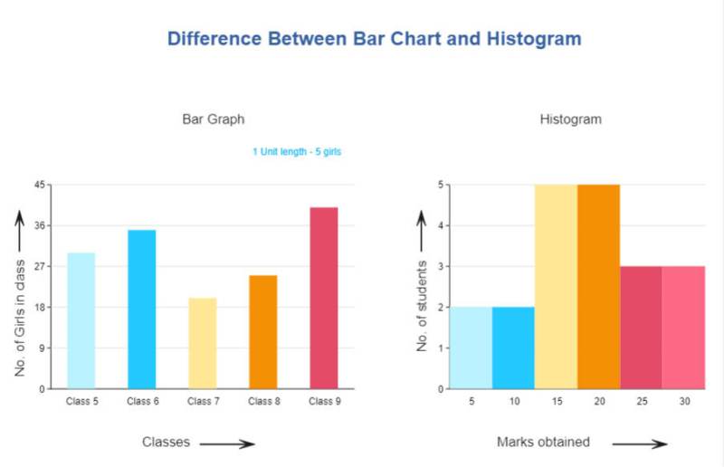
Source:EdrawMax Online
Example 3: Matplotlib Bar Chart
This is a matplotlib bar chart example. It showcases the data of three companies based on the size of sales of three product series. It lists the category of products at the y-axis and the size of product sales at the x-axis. With a single glance, you can tell the difference between each company's sales. For every product, company three gets the highest sales while company 1 is in the middle and company 2 with the lowest sales.
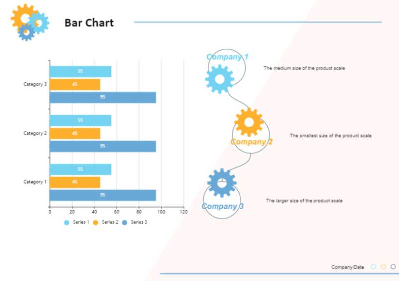
Source:EdrawMax Online
Example 4: Stock Bar Chart
This is an example of a stock bar chart graphically representing the use of business intelligence used by various customers. It plots the cumulative percentage of respondents at the x-axis and company names at the y-axis. It describes each activity of a single bar using different colors to make it easy to understand for the reader. You can also use a stock bar graph to depict the prices of assets from start to close for a specific time period. Before you add colors in the bar, you have to give notes of which color represents which value.
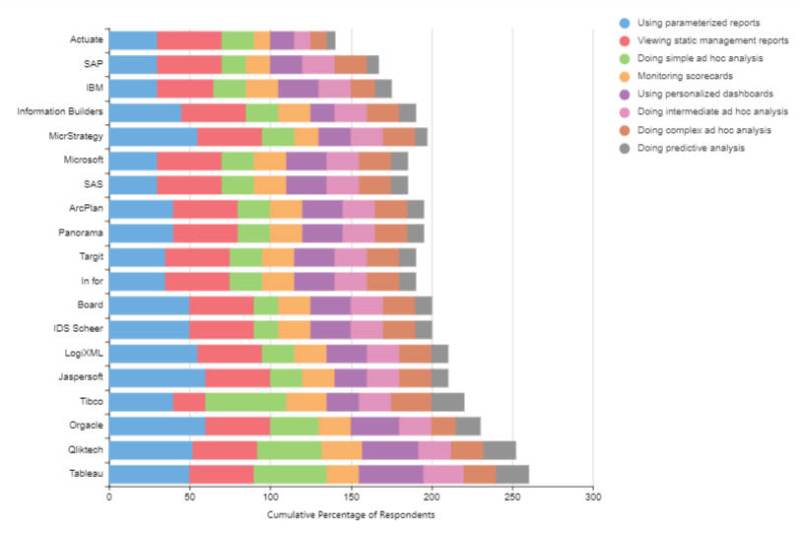
Source:EdrawMax Online
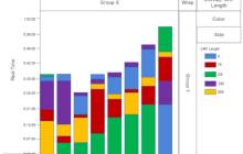
Example 5: Segmented Bar Chart
This is an example of a segmented bar chart, and it depicts the percentage ratio of data series that always adds up to a hundred percent. It illustrates the numerical data based on real-time coverage using rectangular vertical bars divided into sections using various colors. At the x-axis, we got the coverage value, and at the y-axis, we got the real-time activity. You can also call it a hundred percent stacked bar chart as each bar illustrates the same length with various color sections representing different percentages.
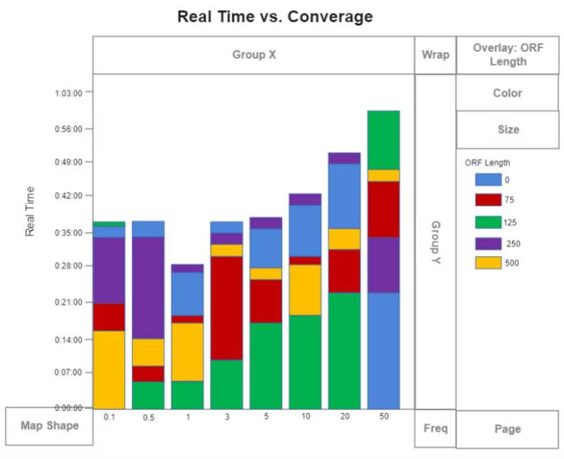
Source:EdrawMax Online
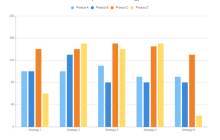
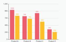
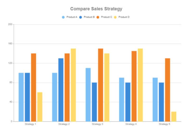
Example 6: Clustered Bar Chart
This is an example of a clustered bar chart illustrating the company sales strategy of various products. As you know, when it comes to planning sales of products, some product sales go up while others go down. It is essential to pick the strategy with the best overall sales results. This graph shows sales at the y-axis and strategy at the x-axis. Four bars cluster together to depict four different products to showcase the effectiveness of each approach.
Source:EdrawMax Online
Example 7: Python Bar Chart
This is an example of a clustered bar chart illustrating the company sales strategy of various products. As you know, when it comes to planning sales of products, some product sales go up while others go down. It is essential to pick the strategy with the best overall sales results. This graph shows sales at the y-axis and strategy at the x-axis. Four bars cluster together to depict four different products to showcase the effectiveness of each approach.
Source:EdrawMax Online
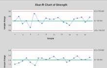
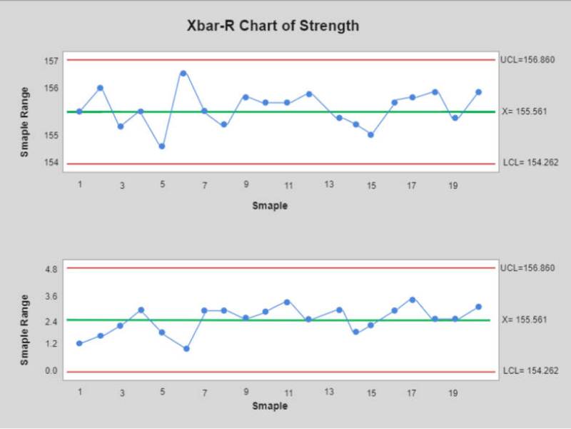
Example 8: X Bar Chart
This is an example of an X bar chart. It is entirely different from other bar charts, and you can only use it for a few specific purposes. Most of these charts illustrate the statistical values of arithmetic means of various constants that allow you to monitor the change in any data value. The shown graph represents the strength of a sample, and the sample range is at the y-axis, and the sample is at the x-axis. You can use it to depict industrial statistics and product manufacturing based on a specific time period.
Source:EdrawMax Online
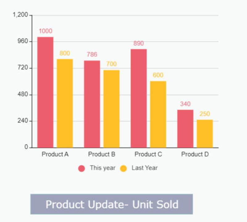
Example 9: Vertical Bar Chart
This is an example of a vertical bar chart, also known as a column chart. It is the simplest and the most used type of bar graph, as you can easily make for any data value. The rectangular bars depict each category and go up to their corresponding numerical value. This example shows the product units sold last year compared to the current year. Each category contains two bars with different colors to represent sales from each year. You will find out that the product sales are going up this year from a single glance.
Source:EdrawMax Online
3. Online Bar Chart Maker
Bar charts are easy to understand, and you can create one to visualize numeric data using bars, but knowing how it works doesn't make it easy to draw your bar chart. All of the bar charts examples listed above are simple, but without an online bar chart maker, you can't create a perfect bar chart. EdrawMax Online is the best bar chart maker in the game as it gives you a comprehensive collection of professional bar graph templates that you can download. It also gives you many customization tools to help you edit the template or create a new bar chart on a blank canvas.
4. Key Takeaways
A bar chart is a visual tool that helps you depict numeric data and compare items between different data groups using rectangle bars. We use bar charts because they are easy to understand, and with a single glance, the reader can figure out the data trend of the graph. It categorizes data into levels to make a simple representation. You can find more bar chart examples in the template community.


