How to Make a Bubble Chart in Excel
The bubble chart is usually seen as a variation of the scatter plot and all the data points are replaced with bubbles in different sizes. In this article, we will show you how to make a bubble chart in Excel and you can try to create another type of chart in a similar way.
How to Make a Bubble Chart in Excel
So, how did we start to make a bubble chart in Excel with its built-in chart tools? Well, before we get started, we need to make sure that the worksheet for creating a bubble chart should have at least 4 rows or columns of data as is shown in the below picture. Otherwise, we will not get the bubbles plotted correctly.
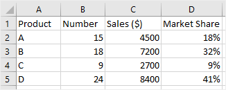
Then, you can follow the steps one by one.
1. Open the worksheet that you want to plot a bubble chart and input the data.
2. Select all the data of numbers and in this example, it’s B2: D5.
Note: Don’t include the row or column headings in this selection. If you do, the chart will produce the wrong results.
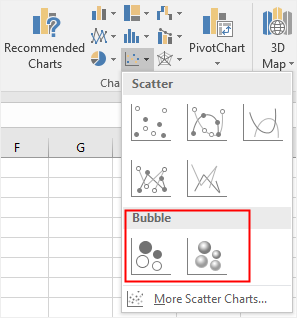
3. Go to the Insert tab, select your desired bubble chart type on the drop-down menu of Insert Scatter (X, Y) or Bubble Chart Here, we choose the 3-D Bubble.
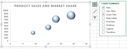
4. Click the chart area and the Chart Tools will appear on the ribbon, in which you are able to change chart styles, chart colors, chart layouts and chart types. Besides, click Add Chart Element button and select to add axis titles, data labels, etc.

5. Now, you can get a new look at your bubble chart if you customize it with these formatting options. Apart from Chart Tools, you can also use the advanced editing options hidden on the floating buttons next to your bubble diagram in Excel.
6. Finally, don’t forget to save your bubble plot.
How to Make a Bubble Chart in Edraw Max
If you want to creatively make a bubble chart in Excel, you can try to use Edraw Max Online and the process will be a wonderful experience for you.
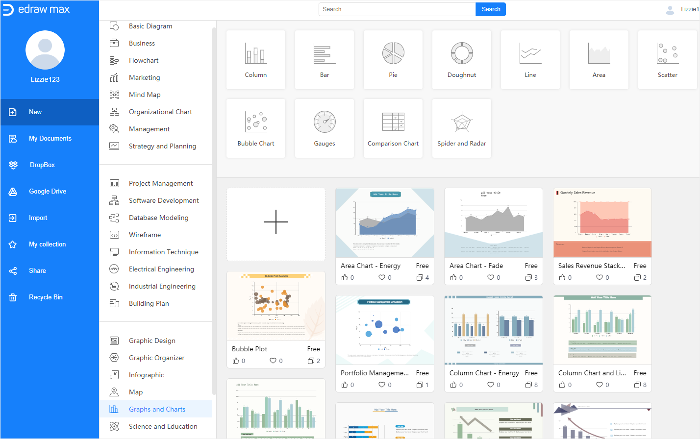
As you can see, Edraw Max provides abundant pre-made graph and chart templates in its template gallery. Thus, after you sign up for Edraw Max, you can use these templates that you like and it’s free of charge.
Click here to find more free Chart templates > >
Here is how to create a bar chart in Edraw Max and make sure that you have gotten the data ready.
After you enable Edraw Max Online, please follow the steps below.
1. Select a template that you want to use, click on its thumbnail and it will be opened on a new webpage. If you want to have a blank template, you can click on the plus icon in the template gallery
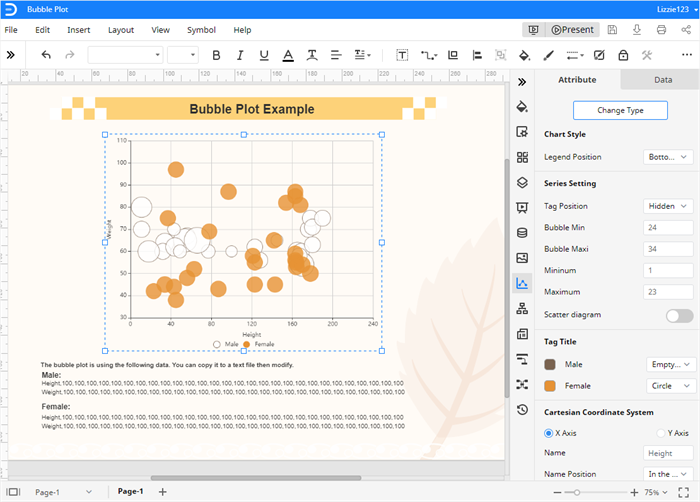
2. Or, click Insert > Chart to open the Insert Chart dialog box and choose Bubble Chart. A new example bubble chart will be added on the drawing page.
3. Whether you choose to use a template or insert an example bubble diagram, select the chart and replace the example data with your own in the Chart (Data) pane.
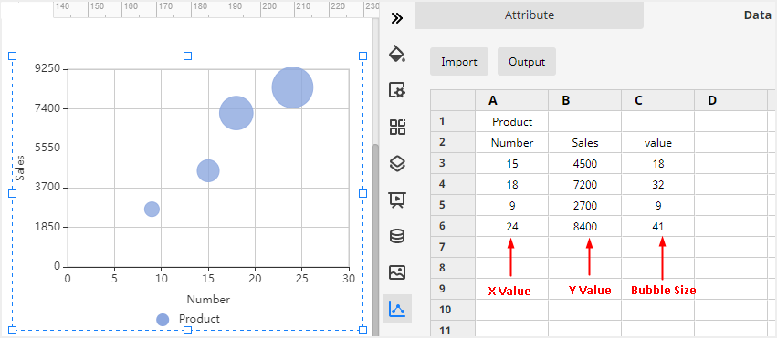
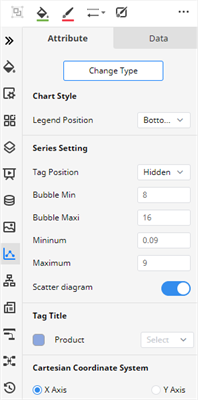
4. 4. Use the shortcut buttons and the formatting options on the right panes and the toolbar to customize your bubble diagram.
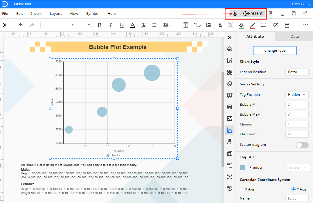
5. When you finish customizing your bubble diagram, you can click on the Play button in the upper right corner of the main interface and check how the chart looks like in a presentation.
How to Export an Edraw Chart as an Excel File
Finally, when you complete your bubble chart in Edraw Max Online, you can select to save it in different places, export it as different formats or share it with different people.
Go to the File tab, click Save As button on the menu and choose to save your bubble diagram in Edraw personal cloud, Google Drive and Dropbox.
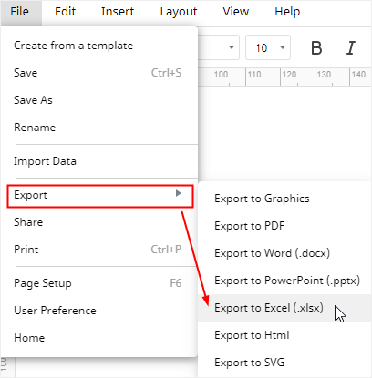
Click Export and pick one of the supported formats on the menu. Here, we can choose Export to Excel and then an editable MS Excel file will be exported and saved on the local storage.
In addition, click Share on the menu and a dialog box will pop up. You can choose different ways to share your bubble charts with your friends, partners or clients.
