What is A Column Chart
Create Your Column Chart NowWhat is a Column Chart?
One may define a column chart as follows:
“A column chart is a graphical representation or visualization of measured data in the form of vertical rectangular bars or columns plotted along two axes with the values representing the measure of that particular category of data.”
The values are generally expressed in units relating to the problem statement or in percentages. These types of charts are mostly useful for statistical comparison of data.
Let us take a simple example. Say for a survey in a city A, concerning the preference of cold-drink brands among its inhabitants. The result can be put into a graphical representation as shown below. In this way, the surveyor can put forward a complete and concise report of his/her survey.
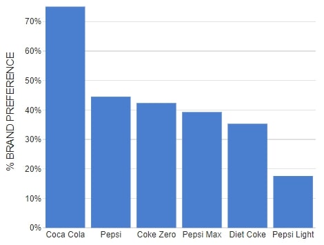
Image Source: netdna-ssl.com
What is the Purpose of a Column Chart?
You can use a column chart to:
- Compare data from related categories
- Understand the change(s) independence of variables over time
- Compare the contribution of different elements of a class
- Compare negative against positive values
- Popular business uses
- Comparing the performance from various business departments;
- Representing business and financial data;
- To compare performance vs. target-line data;
- Comparing individual contributions for related groups and many more.
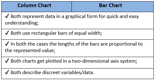
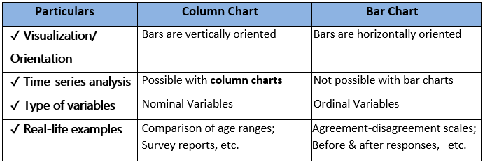
Column Chart vs. Bar Chart
Both bar charts and column charts have more or less the same uses. In this section, we will try to understand the similarities and differences between the two.
Pros & Cons of Column Charts
- Helps to summarize data sets for better visualization;
- Can display proportions of multiple categories easily;
- Can show each data set as a frequency distribution very effectively;
- Very useful for time-series analysis;
- It can quickly clarify various trends and estimate fundamental values accurately.
- Error in estimations can lead to false interpretations;
- Key assumptions and patterns cannot get revealed;
- Becomes painful to interpret in case of a large number of categories;
- Hard to understand stacked column charts as there is no common baseline for measurement.
Types of Column Charts
There are five different types of column charts.
It is the most straightforward column chart. The equal width vertical rectangular bars get drawn against a two-dimensional axes system. This type of column chart is best for comparison between values of more than one category of data.
Image Source: gstatic.com
In this case, you cluster or group many columns under a single category. You can also map it against a 2-D coordinate system. A clustered column chart is useful for comparing value between different categories, each having several sub-categories.
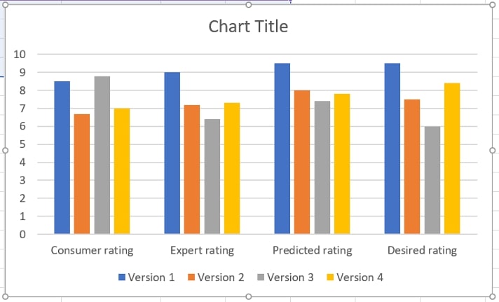
Image Source: gstatic.com
In stacked column charts, instead of grouping the columns side-by-side, they are stacked on top of the other. Once again, in a two-dimensional coordinate system. Stacked column charts are best for undertaking a part-to-whole comparison.
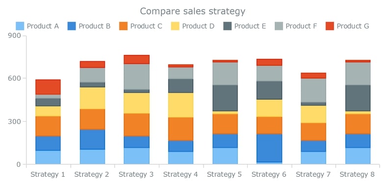
Image Source: gstatic.com
It is somewhat similar to the stacked column chart. However, there are two distinctive features in this type of stacked column chart. One, it is used for part-to-whole comparison in percentages. Two, as the map deals with the rate, all the vertical columns are of the same height.
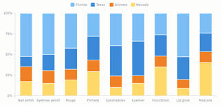
Image Source: gstatic.com
A column chart with scrolling is the same as a clustered column chart with the only difference that the horizontal or X-axis will always have a scroll underneath it. They are best for comparing data over a period, time series analysis for a large number of data sets. The purpose of the scroll is to view a part of the whole chart at a time. You can use the scroll to navigate the whole of the chart.
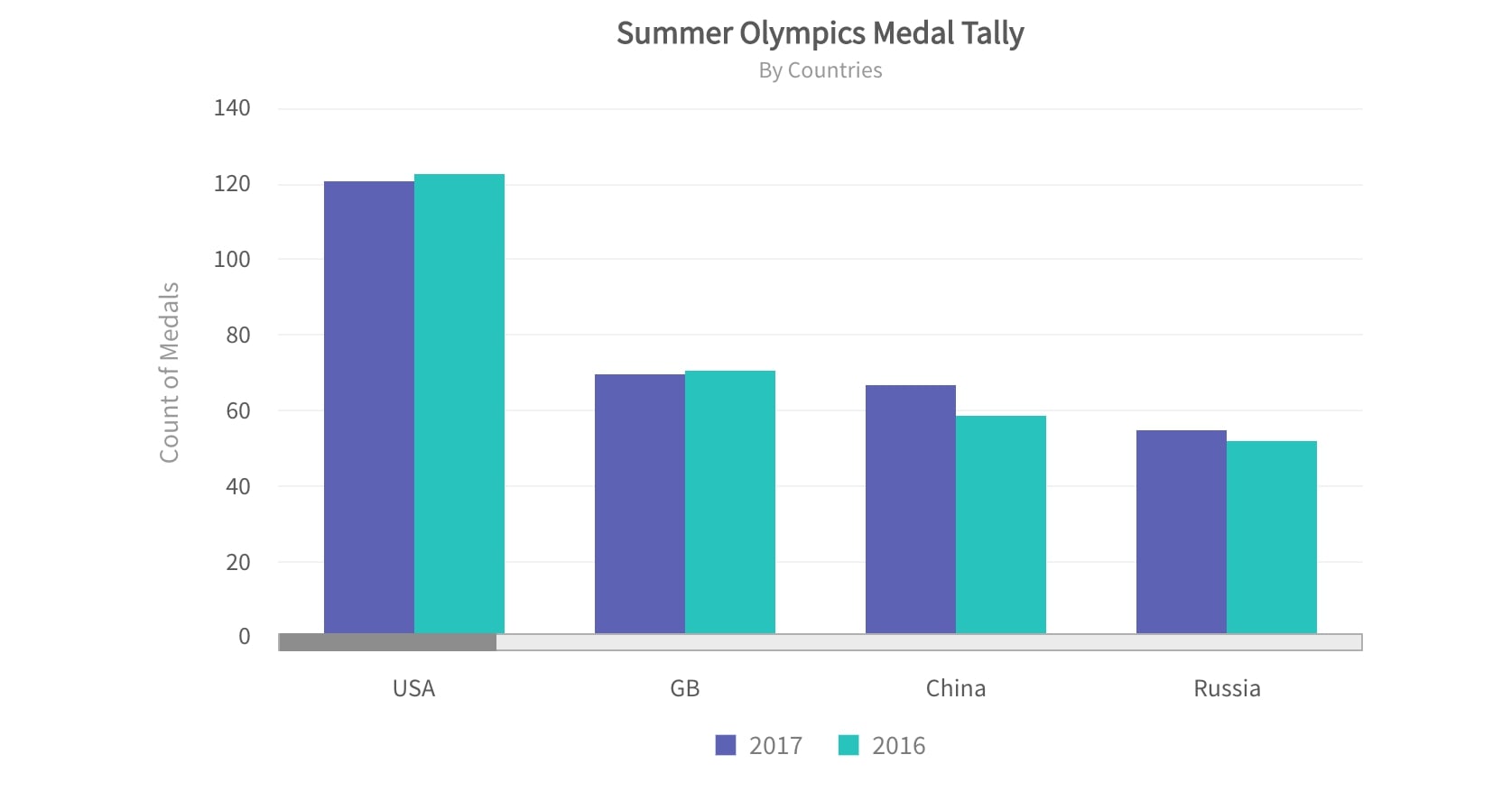
Image Source: fusioncharts.com
Examples of Column Chart
-
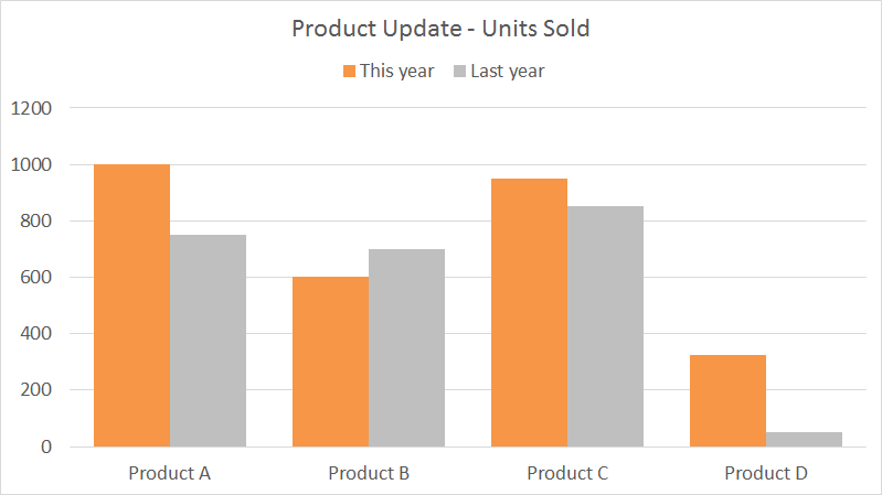
Eg. I: Yearly comparison of sales of four different products of a company
In this case, a clustered column chart is handy. The two clustered bars represent the data value for the two years; while the X-axis houses the four different products, the Y-axis represents the sales figures.

Image Source: exceljet.net
-
Eg. II: Quarterly sales by region
A stacked column chart is the most suitable thing to opt for in this situation. The stacks are representing the various regions viz. East, West, North & South; east, being at the bottommost rung and south at the topmost.
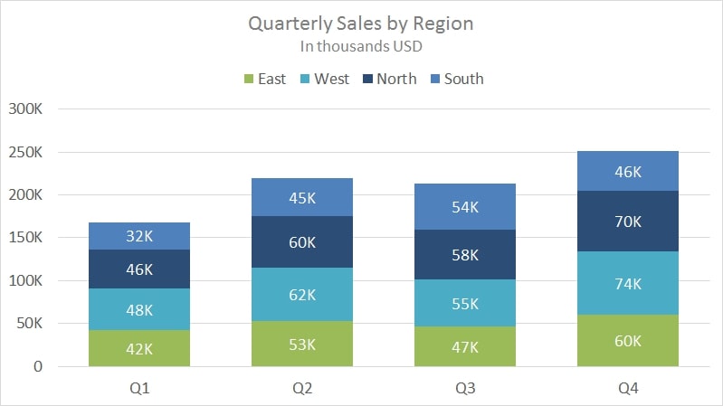
Image Source: exceljet.net
-
Eg. III: Comparison of daylight hours from sunrise to sunset over a year
In this case, you can use a floating bar. As you can see, the orange region represents the daylight hours and floats between the whole bar representing a day, i.e., 24 hours.
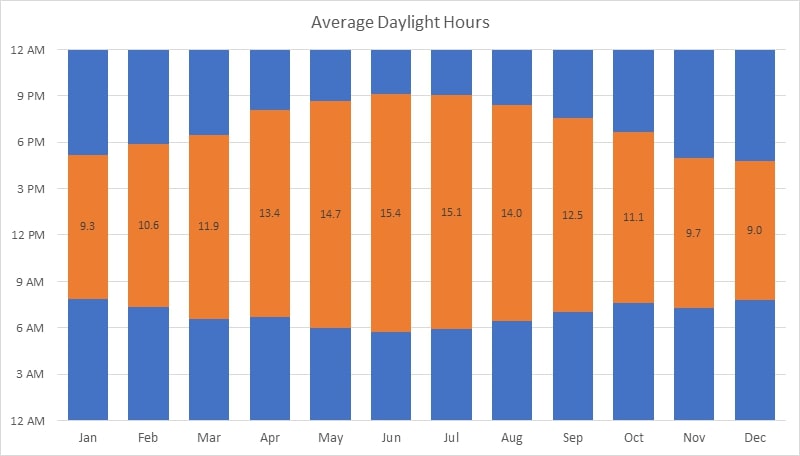
Image Source: exceljet.net
How to Create a Column Chart with EdrawMax Online?
With technology, you can now create column charts very easily using various diagramming tools available. One such tool is the EdrawMax Online diagramming tool. You don’t need to download the software.
In this section, we will see how you can draw a column chart with the help of this tool.
But before, familiarize yourself with the interface of this tool. You can check out the tool from the official website. Other than that, you need to understand the concept behind drawing a column chart.
Creating a column chart is just a seven-step mantra:

Tips on Making Column Charts
By now, you know all you needed to know about clustered column chart. Here are some more tips:
- Arrange data in order and not randomly;
- Keep consistent bar widths otherwise your table will lose all its appeal;
- A 3-D chart is never a good option as it can introduce some percentage of skewness in your data;
- Always start the Y-axis (value axis) at zero to avoid confusion while interpreting the data;
- Do not use grids as they don’t make your chart pleasant to look at;
- Never use different colors for the columns unless you are using a clustered or stacked column chart;
- Always include a title and a source.


