Comparison Chart - A Complete Guide for Beginners
Create Your Comparison Chart NowThere are multiple instances in our daily life when we need to compare different things. From grocery shopping to making any crucial life-changing decision. A dedicated comparison chart is often used. In this post, I will make you familiar with the concept of a comparison chart and would also teach you how to draw one easily.
1. What is a Comparison Chart?
In a nutshell, a comparison chart provides a visual representation of various options that can be compared to each other. It can have their pros, cons, key features, etc. that would depict vital differences between these entities (or choices). Since there is no rule of thumb with comparison charts, they can depict both quantitative and qualitative characteristics. Mostly, comparison charts are easy to make and can help us in educational purposes or to make data-driven decisions.
For instance, consider this example in which different phone models are compared to each other. In this, a table is created with key parameters for each phone model. It would help readers know the difference among phone models and they can pick the device they wish to buy. Therefore, this comparison chart would be useful in both educational and decision-making features.
2. Basic Types of Comparison Charts
Although comparison charts can be drawn in several ways, some types are more common than others. Following are the 5 most commonly used comparison charts that you should know about:
A comparison pie chart is a visually appealing representation of data that is often used in sales and marketing. In this, we will simply compare different components and their share in a certain topic. For instance, you can represent the market share of products or, in this case, how the different sources of energy are compared. Learn more about pie chart
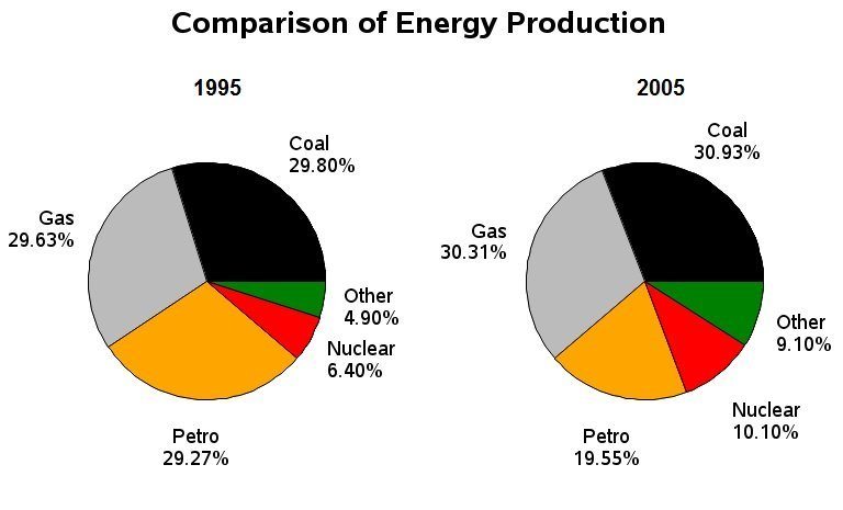
Image Source: ieltsliz.com
A comparative bar chart is another friendly way to compare different items over a certain parameter. In this, we can even compare the frequency of a single entity by using color coding for different sets. In this comparative bar chart, you can see the output of different manufacturing plants in a certain period. Learn more about bar chart
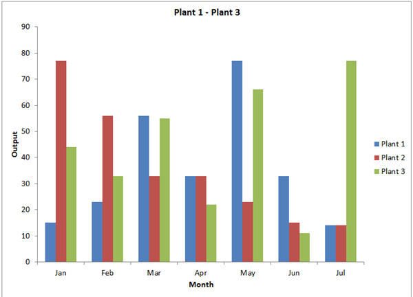
Image Source: qimacros.com
A histogram is a special form of bar chart that has concurrent values and depicts a certain pattern. The first kind involves a change in time with respect to key parameters. In this diagram, you can see the number of hours spent by students of different ages.
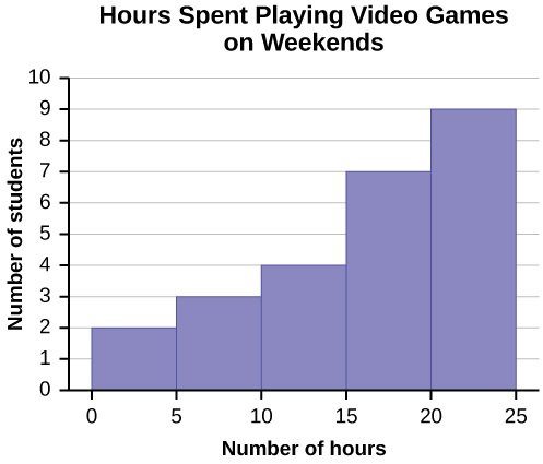
Image Source: textimgs.s3.amazonaws.com
Also known as a line diagram, it plots frequency through another perspective (instead of time). In the end, we are able to establish a particular curve that is also known as a frequency curve.
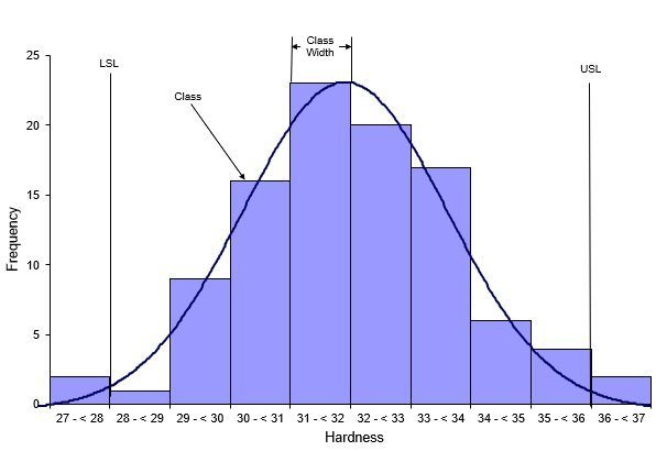
Image Source: spcforexcel.com
This is another interesting comparison chart in which we use dots to represent a value (mostly, one dot = one value). The dot diagram can compare all sorts of parameters and can realize correlation comparison. They are often used in research and education as well.
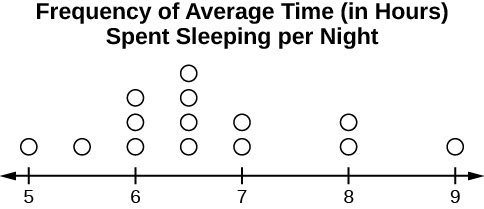
Image Source: cloudfront.net
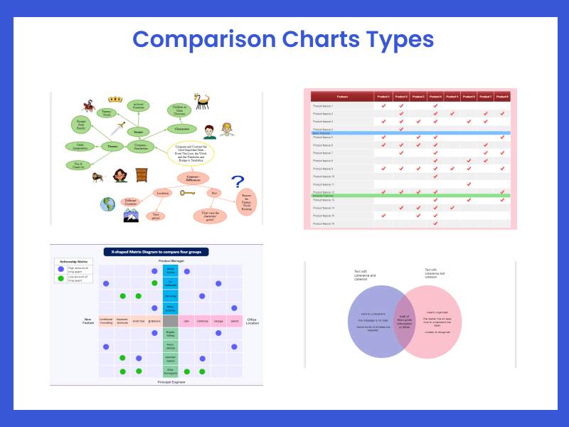
A bubble comparison chart is a creative visual aid to compare students' ideas and problem-solving skills. The idea of the chart is in the center bubble, and all other bubbles are directly or indirectly connected to it. Students brainstorm the problem's solution given at the center bubble by adding more bubbles and mapping relationships using lines. You can also use a double bubble map to compare ideas and solutions for different problems. Make sure your bubble chart is precise if you are using it for reports and essays. Learn more about bubble chart
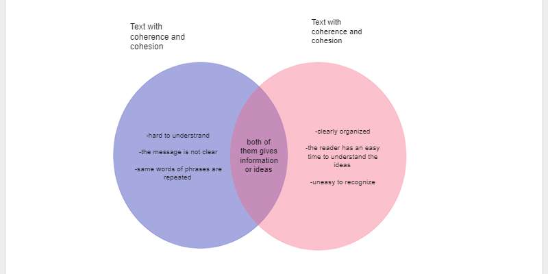
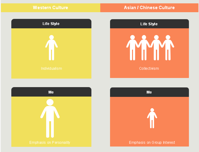
A Venn diagram is the most commonly used visual aid to find the comparison and contrast between various data sets. It uses overlapping circles to represent similar and different data. Creating a Venn diagram is simple, and the reader can easily understand it at a single glance. The Venn diagram in the example uses two overlapping circles to depict data comparison. The blue circle contains information that is hard to understand for the reader, and the red circle contains information that is easy to understand. The intersecting area shows similar information in both data sets. Learn more about Venn diagram
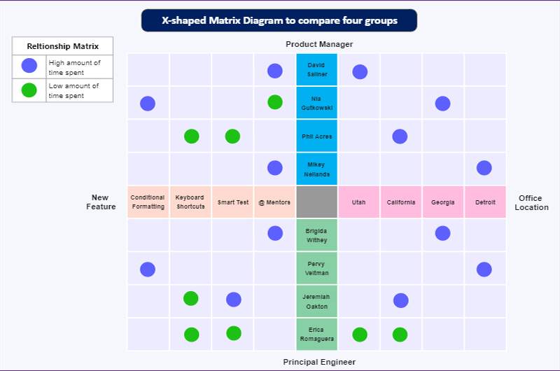
This is a diagram of an x-shaped comparison matrix comparing four data groups. It depicts the time spent by the product manager and principal engineer at different office locations and new features. The blue circles represent the high amount of time spent, and the green circles represent the low amount of time spent. The reader can easily get the general idea of comparing each group. Four different L-shaped matrices are grouped to form an x-shaped comparison matrix in this diagram.
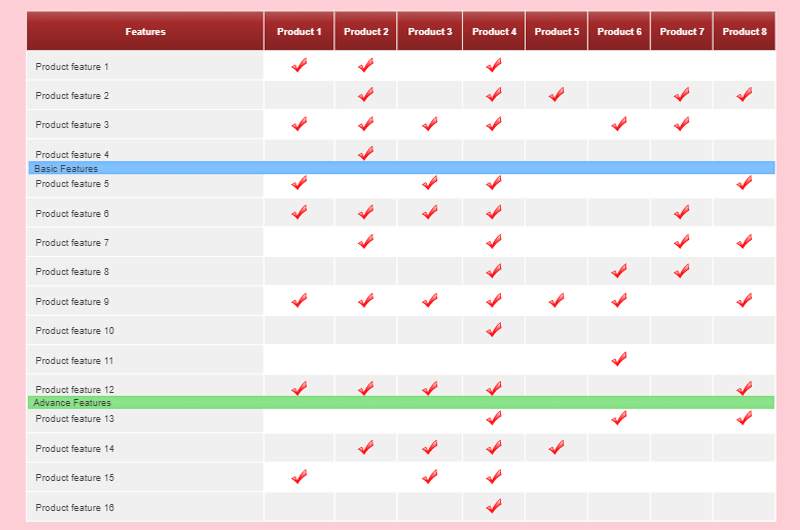
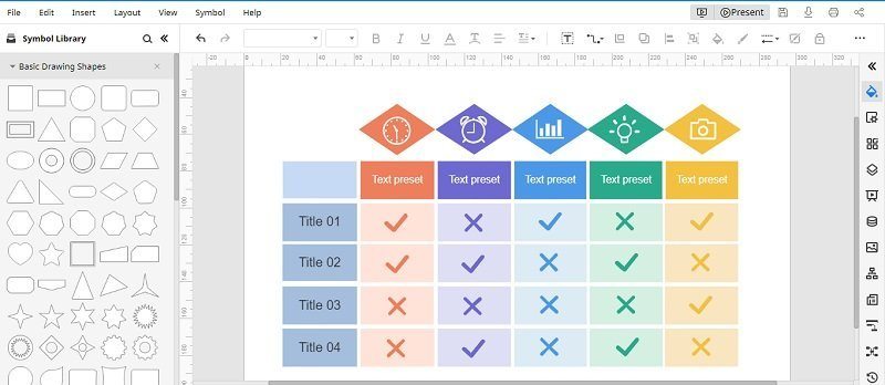
A comparison table is an essential visual aid when comparing various data sets or items with a particular set of parameters. The table given here depicts the comparison of products with various common, basic, and advanced features. It tells the reader which product comes with the most features and gives you the most advanced features. The product names are in the first row, and the features are in the first column. You only have to cross-check and add a check symbol to depict that product comes with the adjacent feature.
3. Comparative Methodology behind Comparison Charts
Most of the comparison charts are based on a central idea, which is known as a comparative methodology. To compare different entities, we first need to find a common ground. Later, we provide a feature-by-feature comparison to know how similar or different they are. For instance, in the above picture, all kinds of mobiles are compared. We have identified at first what connects them (like display, processor, etc.) and later provided a feature-by-feature comparison of all these parameters.
4. Pros & Cons of Comparison Charts
The concept of a comparative bar chart or any other comparison diagram has been prospered for centuries. Needless to say, they have more pros than cons that you can understand after working on a few charts by yourself.
Pros
- Since there are no strict rules with comparison charts, they are easier to make.
- We can compare all kinds of entities and choices related to real-life instances easily.
- There is no limit to the number of things to compare or their parameters.
- Most of the comparison charts (like a table or bar) are extremely easy to draw and understand.
- They can help you provide precise information after detailed research.
Cons
- If the information is too complex, then a comparative bar chart can become harder to understand.
- Lack of standards or universally recognized rules
- If the entities have no common parameters, then we might not be able to compare them.
5. History of Comparison Charts
Since the concept of comparing things is not new, the history of comparison charts can be dated back to the 18th century. One of the first major comparison charts was made by William Faden about the comparison of coastal profiles. Although, it was Charles Smith's comparison chart of heights and mountains, it began to gain a wider acceptance.
Today, the concept has been evolved and is used to compare not just buildings or mountains, but executive decisions and is even used in research methodologies. To compare different entities, tables, matrices, graphs, bars, scales, bubbles, and all sorts of vectors are used.
6. Common Examples of Comparison Charts
If you want to know more about comparison charts, then you can also go through these examples. Find morecomparision charts templates
-
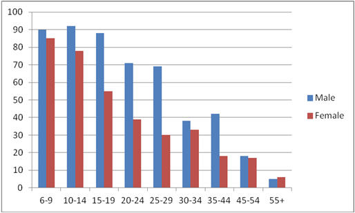
Video Game Addiction Comparison
This is a comparative bar chart of a case study that was done on video game addiction for males and females of different ages. The bar graph has allocated different colors for both the genders and also divided into different age ranges. You can see that the addiction level gradually falls with the progression in age.
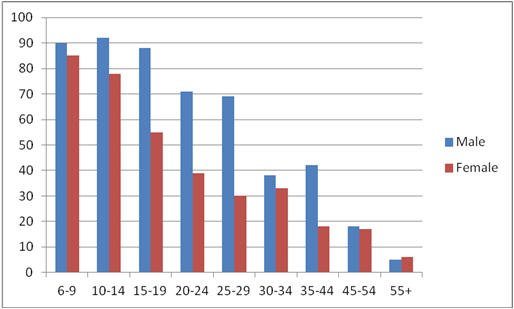
Image Source: teentor.com
-
Commonwealth countries by GDP
This is a basic comparison pie chart that depicts the GDP of various commonwealth nations. The pie chart gives more area to countries with higher GDP like UK, India, and Canada, which is followed by countries with lower GDP.
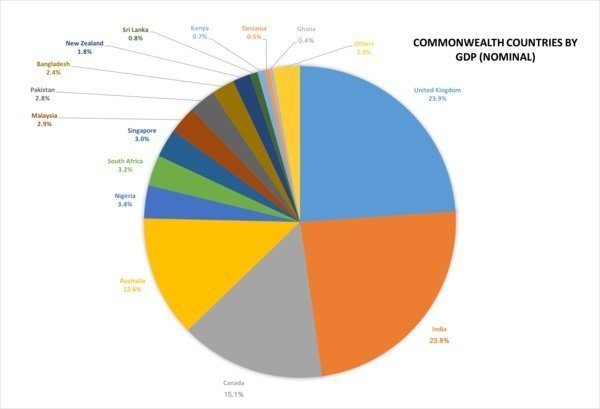
Image Source: wikimedia.org
7. How to create a Comparison Chart with EdrawMax Online?
To create informative and visually appealing comparison charts, you can use a resourceful web tool like EdrawMax Online. You can sign-up EdrawMax with your account and use its services on any device freely.
Step 1: Compile your data
Firstly, collect the related data and try to categorize them under different parameters. Pick the parameters to compare and try to draft the data in a tabular form to make things easier for you.
Step 2: Start working on EdrawMax OnlineTo create free comparison charts, you can just visit the website of EdrawMax Online and sign-up for an account. Once you log-in, you can view all sorts of templates, vectors, and different categories.
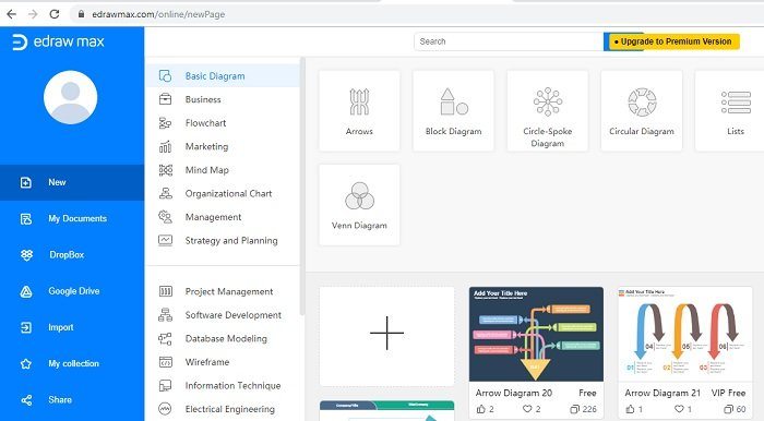
If you want, you can work on a blank canvas or just pick any readily available template from the list as well.
Step 3: Draft an engaging comparison chart
You can work on this user-friendly web tool and draft your next comparison chart. There are symbols to pick from on the left sidebar. While on the right, you can access other features of the tool. Enter your data and make the customized changes in the comparison chart.
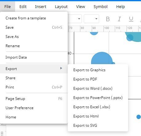
In the end, you can just go to its “File” > “Export” and export the chart in the format of your choice. You can also save it to Google Drive or Dropbox.
Now when you know what is a comparison chart, its types, and how to create it, you can easily come up with all kinds of charts on your own. From a comparative bar chart to a pie chart, you can now work on all sorts of diagrams without any trouble. Feel free to explore the EdrawMax Online tool and draft all sorts of engaging illustrations on your own.
8. Comparison Chart Maker
A comparison chart is a helpful visual aid to compare and find the contrast between various data sets and entities. It doesn't come with a specific format, so you can use various types of charts and diagrams to illustrate a comparison. It only works when the layout and the comparison of data sets in the chart are precise. EdrawMax Online is the best comparison chart maker as it comes with many professional templates and customization tools. It also gives you a comprehensive library of symbols and icons that helps you create a comparison chart from scratch. With EdrawMax, you can effortlessly create a comparison chart and export it in any format.


