A Complete Guide for Pyramid Chart
Create a Pyramid Chart Online Free Free Download Free Download Free Download Free DownloadMaslow’s Hierarchy of Needs chart is a dynamic theory in psychology entailing a model made up of five tiers of the needs of a human. The model usually portrayed as hierarchical levels is within a pyramid. The layers in the chart express human needs as Physiological, Safety, Love and Belonging, Esteem, and finally Self-actualization, in an ascending manner. That is, the requirements at the bottom of the rank must be met first for one to move on to the next level. Interesting, right?
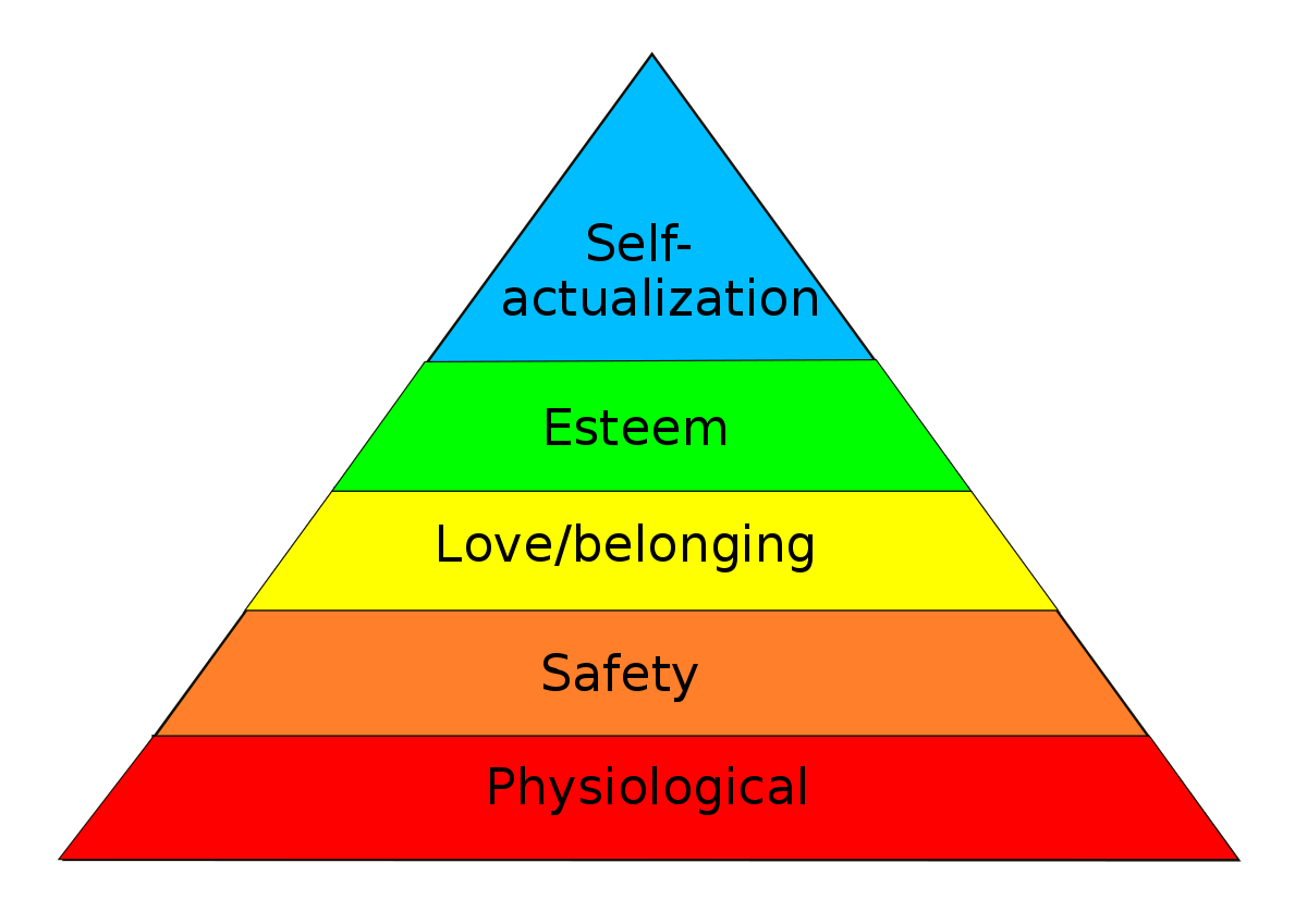
Image Source: wikipedia.org
What is a Pyramid Chart?
From Maslow’s hierarchy of needs chart, we can easily define what a pyramid chart is.
A pyramid chart, also referred to as a triangle chart or triangle diagram, is an illustration of procedural or systematic processes and events. As the name suggests, a pyramid chart is made up of a triangular model demarcated by lines from left to right, and the segments labeled accordingly. The information (steps) represented by pyramid charts is typically in a descending or ascending design based on the process in question.
You are highly likely to spot a pyramid chart in an ad since they are useful in the sales and marketing industry. They can also be helpful in learning purposes as an educational tool, e.g., the food pyramid in studying nutrition. It makes a fun study diagram to teach kids the types and portions of food they need to eat daily for a healthy diet.
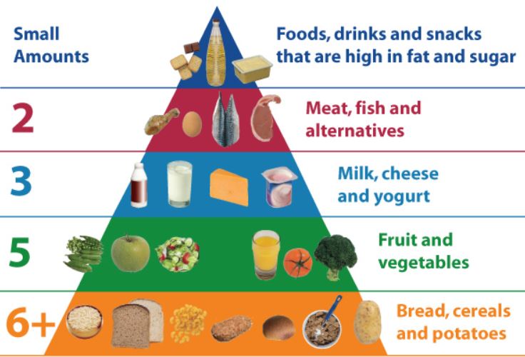
Image Source: donegalnews.com
Why Do We Use Pyramid Charts?
Making a pyramid chart is no rocket science. And if drawn articulately, it enhances the implementation of project processes seamlessly and makes learning enjoyable in the case of an academic setting.
Triangle diagrams are elementary to understand at a glance and are fair to the eyes, hence are incredible teaching aids. Next time you have a marketing or sales task, a project to manage or a class to teach, try using a pyramid diagram since it:
- It exhibits a fine picture of the vital steps of a process.
- Sufficiently displays funnel activities.
- It portrays the structure of an organization in a simple manner.
- It provides an easy way to organize items by size or quantity.
- It gives a superb visual representation of results from surveys and researches.
Types of Pyramid Chart
We are going to discuss five known types of triangle chart in this part of the article.
These are Classical Pyramid, Funnel Pyramid, Inverted Pyramid, Pyramid List Diagram, and Segmented Pyramid Diagram.
Also known as Basic Pyramid Diagram, is simply a triangle delimited into named sections facing upwards. Since they are triangular, they are narrow at the peak. The size of a segment is directly proportional to the ranking level in a particular topic. For instance, the most prominent section could represent a broad topic and narrow up to sub-topics in the subsequent smaller segments.
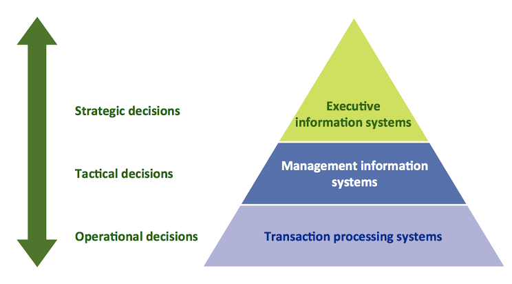
Image Source: conceptdraw.com
This one mimics the shape of a funnel, no wonder the name. It is used to exhibit values of proportions deteriorating progressively. The value determines the size of a section in a pyramid chart in percentage form. This type of pyramid chart is popular among sales teams in showing sales advancement or foreseen sales potential. Otherwise, it displays reports of sales.
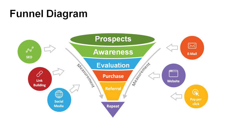
Image Source: powerslides.com
It is an upside-down triangle diagram. It is instrumental in planning the write-up procedure of news stories. They display what details should come first and what the overall structure of a text article should look. In a news story, for example, the most vital information is put in the first segment, followed by the body of the text, and lastly, in the lowest slot is typical or background details.
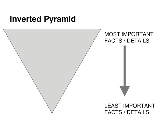
Image Source: slideplayer.com
In these pyramid charts, the labeling or naming of the partitioned units is in rectangle boxes on top of the pyramid background. It is suitable for displaying proportional, interconnected, or hierarchical relationships.
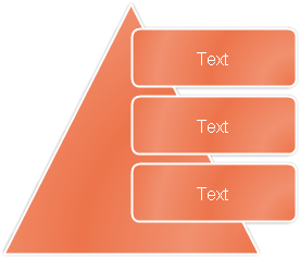
Image Source: slideplayer.com
Segmented is a little bit intricate design of a triangle diagram. In it, the first nine lines of Level 1 text emerge in the triangle shapes. Text not used is not displayed. However, it remains available in case the layouts get swopped. This type of pyramid chart gets restricted to just Level 1 text. It is commonly used to illustrate containment, proportional, or interconnected relationships.
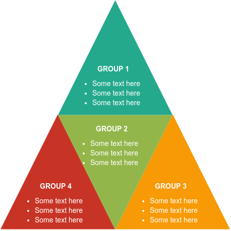
Image Source: visual-paradigm.com
Relationship within the Pyramid Chart
Next, we look at four fundamental relationships common in pyramid diagrams, i.e., proportional, interconnected, containment, and hierarchical.
Proportional – a perfect and real example of a pyramid diagram with proportionality in it is the Pyramid of Giza in Egypt. From Mathematics, "a^2 + b^2 = c^2" the golden ratio is born.
Now, two quantities are in the golden ratio if they have a standard rate with that of their sum to the larger of the two amounts. This type of ratio is also known as the golden mean or golden section and is popularly used to analyze financial markets in the marketing or sales field. Besides the Egyptian Pyramids, standard square pyramids get analyzed based on the golden ratio.
Interconnected and Hierarchical relations – these two go hand in hand and illustrate in a 3D Pyramid Chart with cubes. In such a diagram, there are levels 2, 3, and 4, and the higher you go up the levels, the more the cube segments. It indicates the rise in hierarchy levels and their interconnectedness. These are very handy in explaining priorities and levels in organizational structures and on the foundation a system can build.
Containment – it illustrates best in segmented pyramid charts. This relation in pyramid diagrams is utilized in engineering and architectural fields to help curb injury or exposure to harmful material on team members. Containment pyramid charts show hazard exposure potential ranges hence help architects and engineers involved in making rational and professional decisions easily and quickly.
Classical Examples of Pyramid Diagrams
Having studied pyramid charts this far, it is time we looked at relatable examples in our everyday lives. So here we go:
Food Chain Pyramid
A food chain, from your grade one science, is the transfer of energy from one living thing to the next. It consists of Producers: these are living organisms that make their food and include plants and bacteria. Consumers: there are primary, secondary, and tertiary consumers. These get their food by feeding on other organisms. Decomposers: these are the recyclers in a food chain. They get their nutrients from dead and rotting matter. They comprise bacteria, fungi, insects, and tiny animals like crabs.
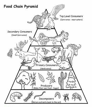
Image Source: pinterest.com
Sales and Marketing Pyramid
Pyramid charts in the sales and marketing field are suitable for researching website marketing niche. They help in pointing out conversions from where potential customers will come from and what action needs to be taken to make a kill in the market. Pyramid charts assist in advancing advertisement strategies based on data collected from researches.
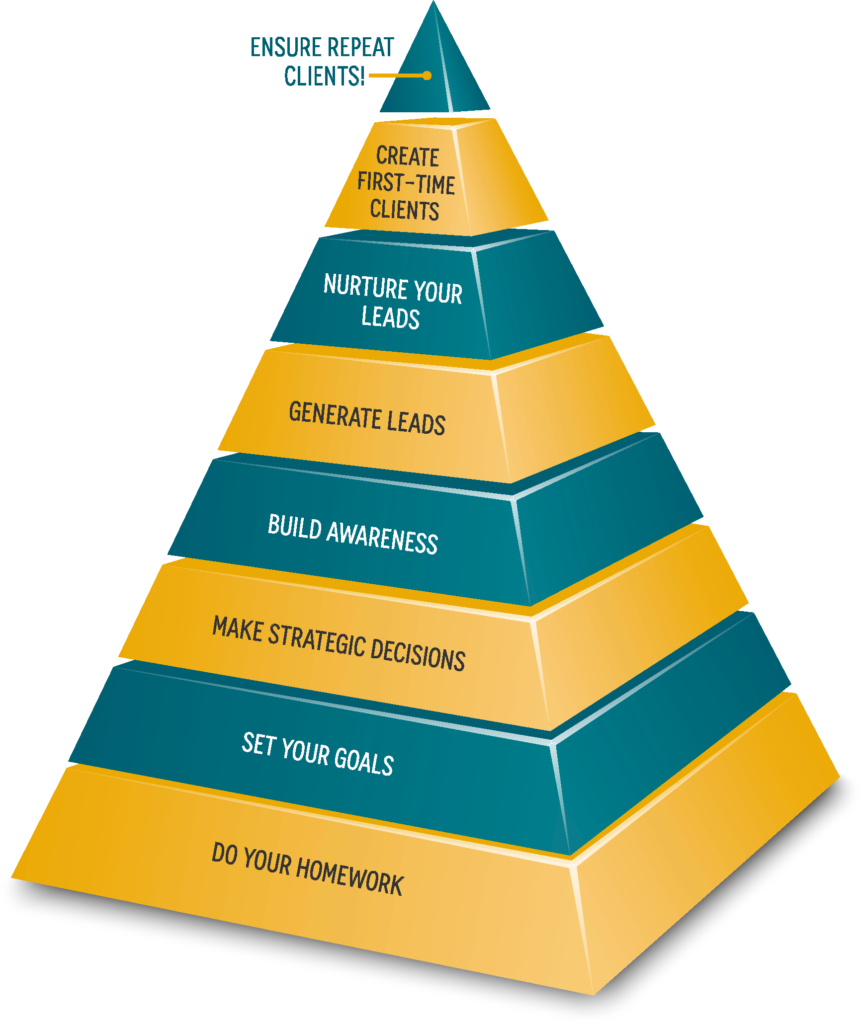
Image Source: harpethmarketing.com
Population Pyramid
Here, the distribution of age groups for a selected geographical region is displayed graphically. The triangle shape is based on the fact that everybody is born at age zero (0), and at the peak where the ordinary age bracket is 90-100, the number of people is very minimal. Population pyramid diagrams are suitable for displaying age group comparisons and ranges for males and females.
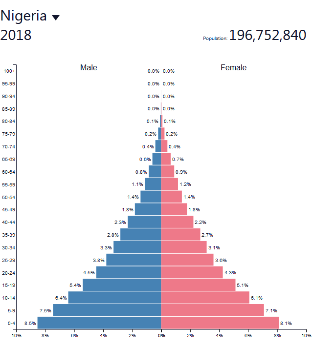
Image Source: globalriskinsights.com
How to Draw a Pyramid Chart
Now, we going to create a pyramid chart using Edrawmax online software. It is a detailed drawing program with numerous free templates, symbols and shapes, and an integrated, friendly user interface.
Before you summon your inner creative self to make a pyramid chart, make sure you:
- Find a suitable title for the chart. What is your story in the pyramid diagram?
- Pick out the segments. Be precise about the partitions and colors you use to make your chart simple, clear, and informatics.
- Ensure you hierarchically categorize the segments.
- Maintain consistency in the size of the sections and color scheme. You don’t want people using shades or feeling bored while studying the chart.
- Make good use of provided templates for guidance and clarity.
After checking the above list, you can now proceed to make your chart on Edrawmax web page from https://www.edrawmax.com/online/


