Templates Community /
Countries Infographic
Countries Infographic
Captain O Captain
Published on 2021-10-09

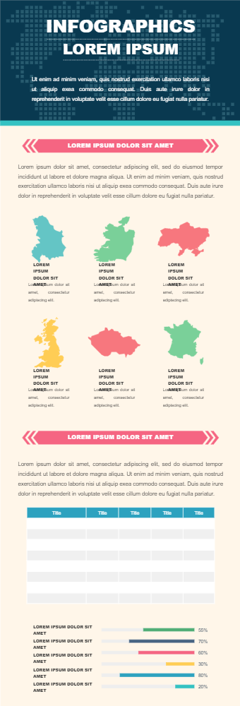
This is an education infographic. It can be used to describe various countries and compare them. The first section has countries outline. This section can be used to introduce countries and provide some statistics basic such as population, location, GDP, etc. The next section has a table and a bar chart. The table can be used to tabulate different statistics against various growth features. Below is a bar graph, it can be used to compare the overall growth of countries from last year. This section will help compare different countries in different ways. The last section can be used to shed light on the result of the comparison such as concluding which country is performing better and what are the factors for it. The layout help to do a comparison among various countries. This infographic can be used by teachers to teach students about the growth of various countries.
Tag
infographic
Share
Report
3
168

Post

Recommended Templates
Loading
