Templates Community /
Bar Chart Hacks
Bar Chart Hacks
Lisa Anderson
Published on 2021-10-19

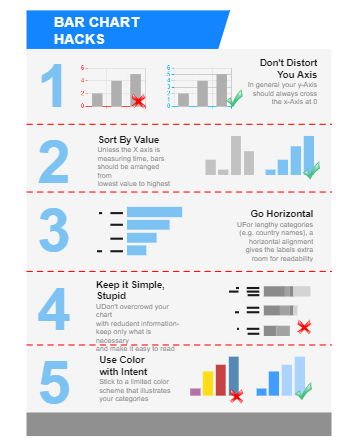
The following bar chart hacks diagram shows the key areas to be considered while creating bar charts for your project. As the below-elaborated diagram suggests, in general, your Y-Axis should always cross X-Axis at Zero. Secondly, unless the X-Axis measures time, bars should be arranged from the lowest value to the highest. You should go horizontal whenever a length category is assigned, as it provides extra room for readability. Your bar chart should be simple, and you should not overcrowd it with redundant information and keep only that content which is absolutely necessary. Lastly, you should not include multiple colors and should stick to a limited color scheme that illustrates your categories.
Tag
bar chart
Share
Report
2
235

Post

Recommended Templates
Loading
