Templates Community /
Final Bubble Mueller
Final Bubble Mueller
Community Helper
Published on 2022-01-25

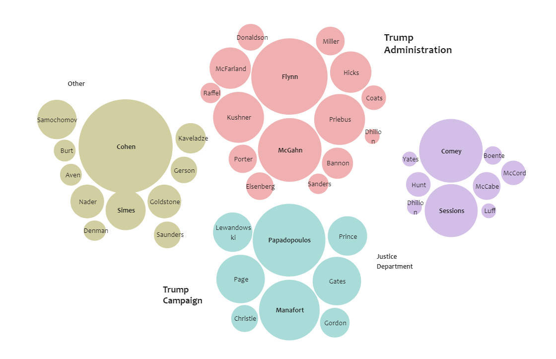
When the redacted Mueller report was released in 2019, journalists across the United States scrambled to read through and analyze the document. Data scientists and information designers were hard at work, too, exploring the text and visualizing relationships and patterns. The New York Times published a compelling bubble chart that laid out which witnesses the report had relied on most. The bubble chart below illustrates individual members from Donald Trump's administration mentioned in Mueller's report. You can also replicate the bubble chart using EdrawMax Online, as the free bubble maker offers several features, including a text editor, icon maker, and others. You can also color the bubbles as per our requirements.
Tag
bubble diagram
Mind Map Collection
Share
Report
6
362

Post

Recommended Templates
Loading
