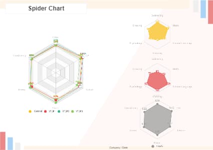
A spider chart, also known as a radar chart, is a visual representation of data that compares multiple variables simultaneously. It is always used to display the relative position of each variable on a set of axes, allowing for the identification of patterns and trends. Here is a spider chart sample. As the template shows, the spokes represent the different variables, while the axes represent the measurement scale or range of values for each variable. Click to learn more details from it.


 Desktop