How to Create a Clustered Column Chart
1. Introduction
A clustered column chart is a bar graph that shows a series of columns with different types of data collected together in a single group. You will see differently-colored columns bunched together on a single point in a clustered column chart. These charts help do a comparative analysis of any given data. In this guide, we will learn the basic rules and how to create a clustered column chart.
2. How to Create a Clustered Column Chart
Using a clustered chart can be helpful when it comes to doing a comparative analysis of multiple values in a single category or group. For example, suppose you are trying to determine how a particular shop has sold many laptops, mobiles, PC cases, and tablets in five years. In that case, you can gather the four variables (the types of gadgets) and then show them on five different points on the x-axis, each of which will denote a year. The columns in one cluster are differently colored to recognizable variables. Don't worry if this does not make a lot of sense. We will take a look at some screenshots in the further sections, which will help you visualize it better.
1. Quantify the values
The columns in each group describe the quantity of a certain value. Before embarking on your chart-making project, take a pen and paper and note down the different values that have to be denoted by the columns. This step is worth practicing because it is very easy to err and make mistakes where precise numbers and calculations are involved. It is entirely different if you are using an application that allows you to resize the columns at any point during your project. But still, it's better to be careful and precise the first time around.
2. Prepare a key to explain the colors/values
In a clustered column chart, you must include several bars in one category. Since they are all joined together, you have to give them different colors easily distinguishable. Every color represents an additional variable or element. To let your reader know what each color means, you can include a key/legend at the side of your chart. You could add labels and pieces of text right alongside the columns, but that would make your work cluttered.
3. Choose your software
Once you are done laying the foundations, it's time to start working on the graphic itself. You can do that by hand, but if you are reading this post, then it means that you are probably trying to learn how to do the same thing on software instead. Don't worry, because next up, we are looking at a step-by-step tutorial on how to create a clustered column chart with EdrawMax Online.
If the video doesn't play, please visit it at YouTube.
3. How to Create a Clustered Column Chart with EdrawMax Online
You can start as a free user by default and access the basic features. To sign up, click on EdrawMax Online, and select the 'Create Account' option.
Once you're in, go back to the homepage. Click on 'New' and see a window open up with many different categories such as 'General', 'Business,' 'Network' etc. Go down and select 'Graphs and Charts' in the' General' category. Click on 'Column' and select the 'Blank Drawing' option. (New > General > Graphs and Charts > Columns > Blank Drawing).
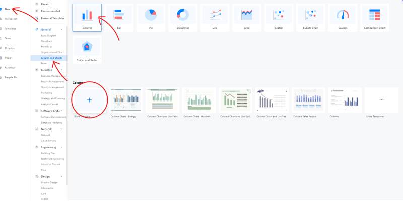
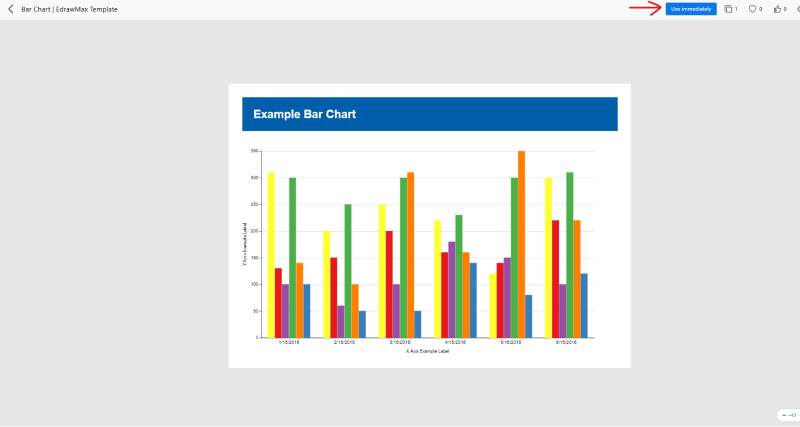
If you don't want to make a drawing from scratch, you can use a premade template instead. Open the homepage and select the 'Template' option from the left menu. Once the template gallery opens up, browse the list of categories and click on 'Graphs and Charts'. A list will further drop down to choose the 'Columns' option. Then, you can choose whichever premade drawing you want and edit it as your own. Once you click on a template, a preview will open up where you can press the 'Use Immediately' button to bring it to the drawing board.
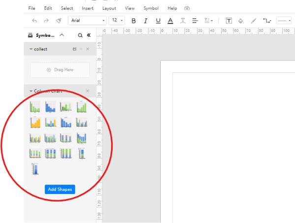
With EdrawMax, the user interface allows you to drag symbols and icons from the library to the canvas in a single click-and-hold motion. However, if you are making a clustered chart, you will not be dragging around a lot of stuff. You have to pick your selected graph and bring it over to the board. After that, you need to edit the values, styles, many variables, etc. Here, check this screenshot, and you will see that there are just a bunch of options to choose from in the library. In other types of drawings, there is a whole range of icons that you can use, but in the 'Columns' category, you can only select your desired type of graph.
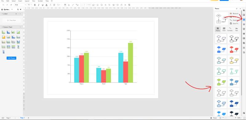
Once you have selected the clustered chart, you can mess around with the colors of the columns by visiting the 'Theme' menu from the right bar. The various themes change the color combinations used in your drawing. This is a nice feature to give your graph a unique look and make it different from the generic, default one.
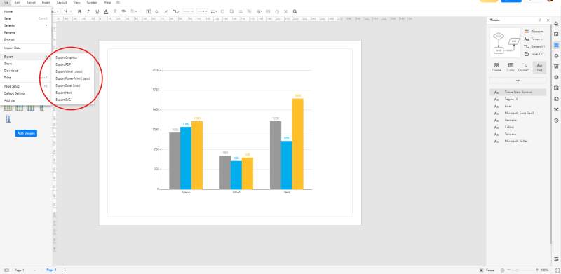
Once you are done creating your chart, you can either save it as an online file or export it to a format of your choice. You can access it only by opening up the application on your browser by saving it online. Press the 'CTRL + S' shortcut to save your drawing on the cloud. On the other hand, exporting lets you bring your chart in a popular and well-known format, so you can open it with any other app and share it with other people. You can save your work offline in PDF, SVG, Word, Excel, and PPT formats.
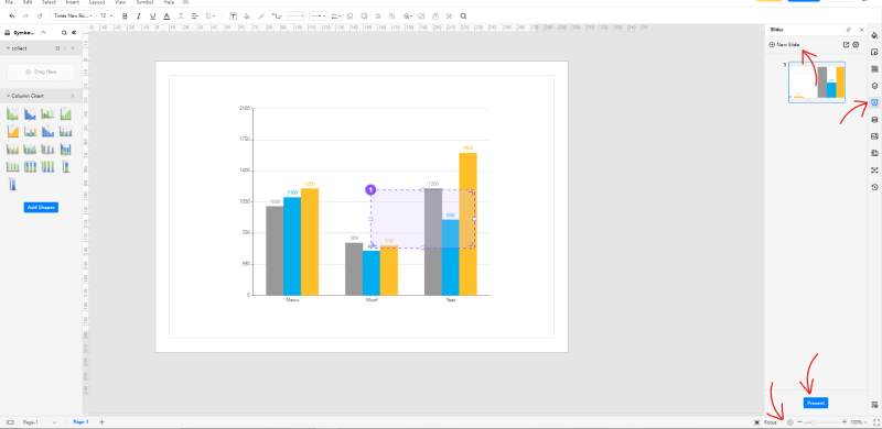
You can present your chart without having to export or save it anywhere. If you want to show the drawing board without any edits and custom touches, you can click on the play icon at the bottom right of the window. This starts a slideshow, and it's a great way to present the stuff on your canvas without any surrounding tabs and menus. You can switch through the pages by pressing the arrow keys, and you will get a black screen once the pages are all up. The other thing you can do is create some custom slides. Go to the right menu bar and select the 'Slide' option (the fourth one down). A menu will open up adjacent to find a button marked 'New Slide'. Click on that, and you will get a purple selection box on the drawing board. This selection box lets you choose what portion of the drawing to include the slides and exclude. This is handy if you want to show a specific part of the entire diagram and not the whole thing.
4. Expert Tips for Making Clustered Column Chart
Draw your columns vertically
When making a clustered column chart, or any other bar graph, you should make your columns along the y-axis and perpendicular to the x-axis. This is how the orientation usually is, and it is easier to read than horizontally drawn columns.
Space the columns closely in one group
When making a clustered chart, you get the option of setting the space between the different columns in the same group/category. Take a gander at the last screenshot, and you will see that the grey, blue and yellow columns are all close together since they belong to a single group. If you space them apart, the reader can confuse them with other bars from the rest of the groups.
Use contrasting colors
To make it easier for the reader to peruse your chart, you should use sharp and contrasting colors for the columns. This will help the reader spot the different heights easily and identify the various bars.
5. Key Takeaways
And that's about it. After reading this guide, you will hopefully have a better idea about drawing a clustered column chart using EdrawMax Online. The software is easy to use, and it comes with a free version for those users who like to live on freebies (let's face it, we all do). You can collaborate with other users by presenting your drawing or sharing the file in an exported format.
With EdrawMax Online, coming up with a column chart is a piece of cake. You can choose a premade template from the gallery and save time/effort making the base layout. You can set the theme on your diagram to tinker with the colors and give it a personal touch. Find more column charts examples