What is a Brochure - Types and Examples
Create a Brochure Online Free Free Download Free Download Free Download Free DownloadWhat is a brochure?
Believe it or not, almost every individual is growing tired of the digitally driven world, where brands are giving their best of efforts to be heard. Not just this, they are stalking customers, who are either running away from them with a frown on their face or turning a blind eye to all that’s been flashing on their screens. In such a scenario, marketing products and services through booklets sound decent. But the question that instantly pops up in one’s mind is that - “is it even relevant?” After all, it's a traditional form of marketing, which people believe has already lost its significance over time. But recent research, conducted just a year ago reveals the following:
- 70% of tourists still prefer to look up at an infographic content
- 80% of the population plan to visit a company, the products, and services of which they see in a catalog
- 95% of the population’s awareness is stirred up by the same
Not just customers, even businesses prefer it for the following three reasons:
- cost-effective
- a consistent form of branding
- impressive, in terms of reach across the target audience
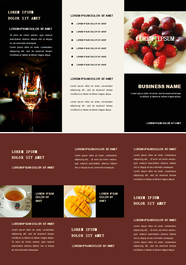
If you are a business owner, currently going through this guide, we bet you would hardly deny the reasons pointed out above. To you, we have great news to share - this form of marketing is still alive and you can use this tangible tool to win over your prospective customers’ hearts. Here’s how it appears and feels:
So, what is a brochure?
While the Wikipedia defines it to be a foldable informative paper document, used up by an organization for promotional purposes; others know it to be a cost-effective tangible marketing tool which is distributed in bulk to the public. You would notice it either in a template or a pamphlet or leaflet form, subtly introducing you to a company and its featured products and services.
Why Use a Brochure?
The sole purpose of such an informative paper document is to create awareness about a specific thing in a lucid language, easily understandable by readers. Exemplary are those that take little time to capture the attention of prospective customers, covering the twin objectives of cost-effectiveness and pocket-friendliness without failing to be a solid future reference for products featured by a company.
What are the Functions of Brochures
Let’s check out the advantages and benefits of investing in brochures than on other promotional tools.
- The first and foremost advantage is that it’s cost-effective
- A storehouse of information, comprising of featured products and services, organised in an eye-pleasing way with appealing fonts and images.
- Encloses easy to read texts printed in visually pleasing font style.
- Combines both images and texts, making it aesthetically appealing.
- Distribution of such foldable pamphlets is hassle-free, whether you choose to hand out the same, keep it in an exhibition stall or display it in a reception area.
- Helps brands build trust among their customers by revealing their devoted side. Moreover, with ample space for accommodating reliable credentials and business practices, brands get to portray a serious picture of them into the minds of their customers.
- Offers a blank canvas to businesses to express themselves about products/services and discounts.
- Allows brands to add a personal touch without hampering the one-on-one communication.
- Since people mostly associate printed merchandise from a business to a company that’s serious about its customers, investing in the same would help them earn credibility in the market.
What are the Types of Brochures
Brochures, depending on purpose, layout and format, appear in five different designs. Each has a specific role to play. Let’s check out the same below:
Bi-Fold
If a formal layout is what you desire the most for your handout to be distributed in corporate meetings and trade shows, this shall serve your purpose well.
Tri-Fold
The name itself is indicative of the folds witnessed in such a circular style. The plus point of designing such a template is the ample space available for a designer to exercise his inherent creativity with attractive pictures and texts.
Z-Fold
This particular design in pamphlet oozes versatility from every respect. It enables designers to take advantage of every panel separately to draw the attention of customers or use it as a whole to insert a dramatic picture altogether.
Gates Fold
Unlike the rest, it’s quite uncommon. However, it’s a little on the expensive end, primarily because of the benefits it comes along with. One of them is the inward folding design, adding to carrying convenience. The other benefit is that it lasts long, owing to the quality paper used up in the making of this remarkable leaflet.
Cross Fold
This style finds its application in tourism guides and transport maps, chiefly because of its convenient size, allowing readers to carry it with much ease. Moreover, it holds a lot of diagrams, maps and poster-like visually pleasing designs.
Die-Cut Fold
This appears in a dynamic Z-shape design and takes very little time to catch the eye of readers. So, it’s best suited for trade shows and conferences, where visitors already stay pre-occupied with other content and look for something interesting to go through. Introducing the same enables a business to stand out from the crowd.
Brochures VS Flyers VS Leaflets VS Pamphlets
Let’s go one by one. Flyer appears in a single unfolded sheet with a shorter lifespan, whereas brochure is just the opposite. However, when the same difference is run on leaflet and brochure, the former comes out as a commonly distributed thing, mostly in public places, whereas the latter is not spread out so frequently because it’s relatively expensive. Regarding pamphlets, the dissimilarity lies in purpose, with the same acting to inform instead of selling products/services of a brand.
What are the Elements of a Brochure?
Since the ultimate objective of the same is to sell products/services, it has to be designed keeping in mind all those elements that would boost up conversion rates. So, here goes the list:
- Steal the spotlight with an uncluttered design on the cover, depicting an image, a logo, and a catchphrase
- Arouse curiosity with a compelling text
- Set your readers’ mood by picking out bright colors
- Go with fonts having different sizes
- Leave some white space at the time of designing to offer an uncluttered look
- Judiciously use boxes to highlight an image or information
- Plan a suitable fold that best complements the information and images
- Enliven it with the insertion of 2-4 pictures
Brochure Examples
Tour Brochure
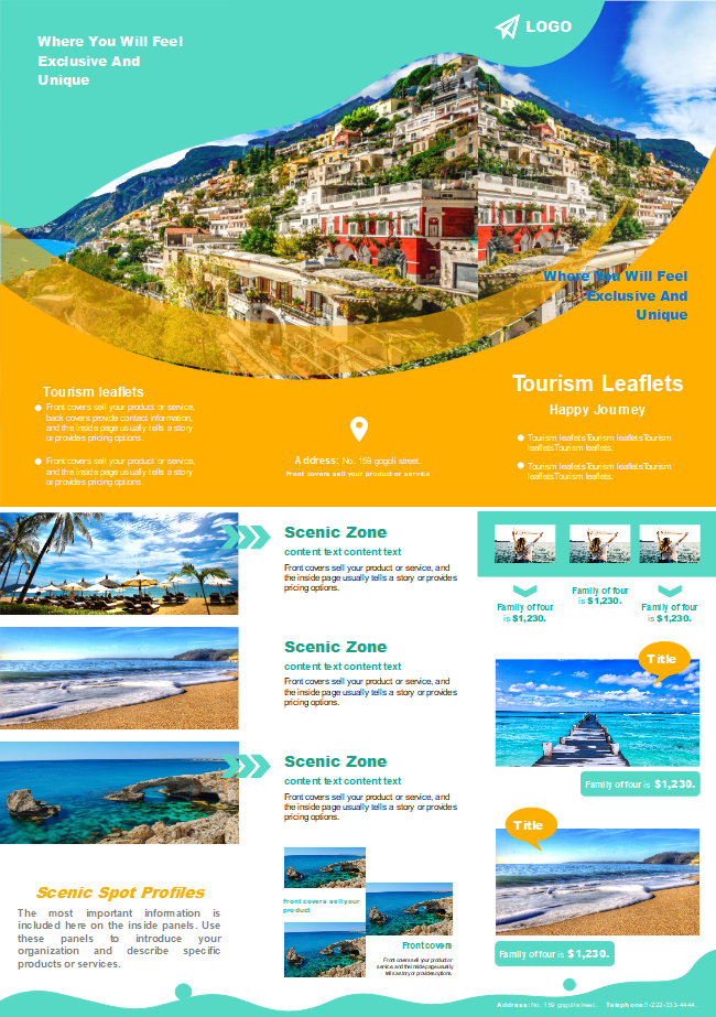
As you can check from the unfolded brochure sample depicted above, there’s an uncluttered cover page for a tourism company to imprint business name, a small tagline and contact information below. The rest of the pages have ample space for them to showcase top destinations and itineraries.
Company Brochure
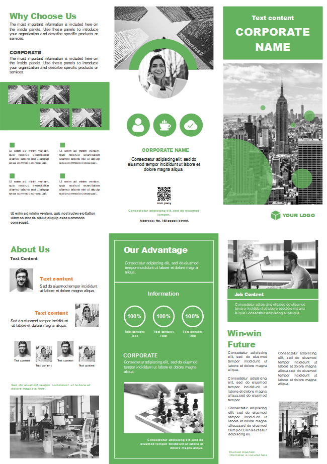
Get a cue of a professional layout typically witnessed in company circular. Throughout the unfolded promotional piece, you can trace several heads and sub-heads. The only commonality between a tour and a company template is the minimalist cover page, so grab the greatest attention.
Sales Brochure
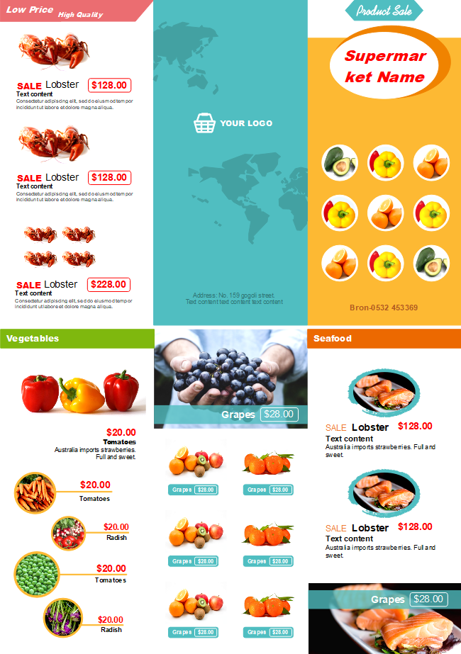
This is one of the most common seen templates, distributed by supermarkets, featuring grocery items, their tags and prices. As you can see, it’s visually stunning and catchy at the same time, differentiating it from the two above.
How to Design a Stunning Brochure with EdrawMax?
Fascinated by the brochure samples already? Then, you must be curious about the software simplifying the designing part. EdrawMax is an excellent brochure maker coming with extensive built-in brochure templates. You can create a brochure from scratch or from a ready-made template.
Step 1: Download and Register
Step 2: Start with a template
Go ahead by double-clicking the same to create a new drawing page. If you fall for a pre-made template, you can always start with it and edit the same according to your taste and preference.
Step 3: Decide on a perfect page size
To complete this step, you need to scroll over to the "Page Layout" tab and find options like page orientation, grid, size, unit, ruler, etc under it. Adjust them accordingly to arrive at an ideal dimension.
Step 4: Adjust margins and the space for the insertion of texts and pictures by developing a layout grid
The motive of this step is to divide the entire blank page into several columns to position the images and texts properly. Now, take advantage of the guideline to arrive at a result. To insert the same, locate horizontal and vertical ruler and drag it to create a guide. Move it by selecting it with the mouse pointer first and shift it to the desired position. To lock the same, access the "Home" tab, press on the "Protect" button and pick out the X position as well as the Y position.
Step 5: Insert text and images
Before inserting text, first create the fields from the ‘Form’ library, by dragging and placing it on the right-hand side. Since the text field is adjustable, pull it into a definite size to complement your layout. Then, add text as much as you can and before finalizing it, do not forget to customize the font style by moving over to the ‘Home’ tab and clicking on the ‘Font’ menu.
Hang on, it’s not over yet. Always remember to insert an image to beautify the foldable leaflet. To do so, move over to the ‘Insert’ tab and press on the ‘Picture’ button. Drag or nudge to position it.
Step 6: Choose from vectorial illustrations to add it
Browse through the EdrawMax collection to arrive at the perfect illustration. Start by clicking ‘Library’, ‘Illustration’, choosing from them and dragging as well as dropping it to the right space.
Step 7: Export, Print or Share
EdrawMax file is compatible with lots of common-used files, such as MS Office, PDF, JPG, SVG and so on, feel free to export your remarkable brochure to the file that you need. Besides, after clicking the "Print" button, you will quickly get a high-quality printed brochure.
Development of Brochure: Digital Brochure
We believe a physical booklet is far more effective than a digital one though many of you would point out at the latter’s cost-effectiveness and impressive reach (be it through an email attachment or in PDF format on one’s website). But, if you can recall the introductory lines of this guide, you would stick to printed ones. This is because people are feeling drained by the annoying interference of the digitally driven world.
It’s better not to follow the trend and find your unique way of promoting products to catch the attention of your target audience. If it means through EdrawMax installation, go ahead having full faith in it and check for yourself the amazing returns on a trivial investment.
